Mobile Commerce – Optimize Your Thumbnail Images for Speed

It is no secret that the mobile marketplace is growing. More people every day are placing orders on their mobile devices. Last year, for the first time ever, sales of mobile devices outpaced sales of PCs. While speed may not seem super important to people using their mobile devices on faster 4G networks, all online retailers should strive to make their mobile stores as fast as possible for shoppers on slower 3G networks. One common speed hog is that many merchants don’t optimize their product thumbnails for mobile platforms. Rather, they pull their standard full screen thumbnails which just eats bandwidth since they typically get resized by the css max-width and max-height properties.
If your mobile platform is setting a max-width and max-height property of 75pixels and you are loading an image that is 250 pixels by 250 pixels, your image has an extra 56,875 pixels that aren’t being used! Now imagine if you have 25 products listed on a category page. You can quickly see how optimizing your thumbnails will vastly improve the performance of your product list and search results pages on mobile devices.
How do you go about optimizing your images? The best way is to use a graphics program like Adobe Photoshop. There are also some free online tools that can be used if you can put up with the advertisements.
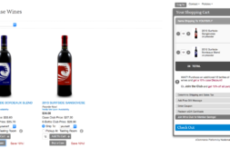
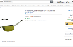
What size should my images be? That is a tough question to answer. If you look at the leading online retailers, there really isn’t a standard size. However, most make an effort to consistently size their thumbnails so that the product list screen looks nice. Generally speaking we have found that apparel companies size their thumbnails a bit bigger than other companies that sell books and the like. For example, Gap.com sets a width of 105pixels for their product thumbnails in their mobile store while Amazon’s book images are only 49 pixels wide. The best thing to do is try out different options for your store. If images are important, go a bit bigger. Find the size that looks good, but also is reasonably fast on a 3G network.
For Nexternal Clients:
If you are a Nexternal client and would like to optimize your product thumbnails, please follow these steps:
- Visit Layout/Edit Mobile Layout and ensure that you have activated your mobile-friendly store.
- Edit a product and visit page 2. In the overrides, you can upload a mobile thumbnail.
- By default, Nexternal’s system put the max-height and max-width attributes at 80pixels so keep your longest measurement at 80 pixels to optimize page load time. If you want to change the max-height and max-width, you’ll need to do that in the Mobile Style Sheet Addendum (Layout/Edit Mobile Layout).
After receiving a degree in Industrial Engineering from Cal Poly San Luis Obispo, Alex began his career as a technology consultant with Accenture. In 1999 he left Accenture and founded Nexternal – a cloud-based eCommerce Platform company. Alex is passionate about eCommerce and online marketing. He is now a Senior Vice President of HighJump, managing the Nexternal business unit.


