Optimize YouTube Videos for Mobile Devices
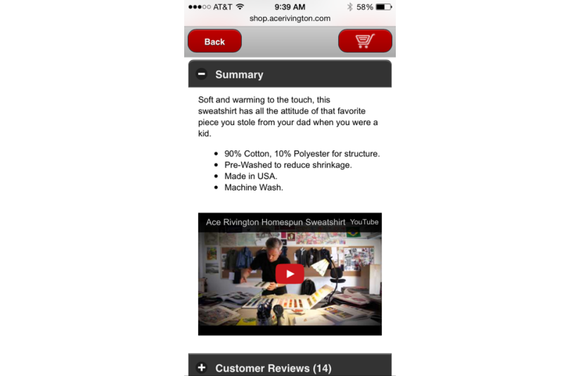
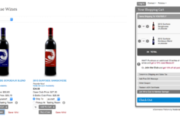
iPhone Vertical View
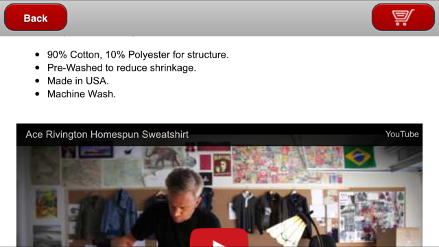
iPhone Horizontal View
The examples above display Fluid YouTube videos that are optimized for mobile devices. These videos resize depending on the User’s Device Screen size.
Responsive Web Design (RWD) is all about improving the user experience. It ensures that the page and content the user is viewing adjusts depending on the device they are using. Many merchants only focus on making their coding and navigation responsive and they often forget about their content. While it is imperative that your site and store framework be responsive, it is increasingly important to make sure your content displays in a user friendly manner as well.
YouTube Videos are commonly added to eCommerce storefronts, product descriptions, and custom tabs on a product page to improve the shopping experience, SEO of the Product Page, and interaction with the item. The only issue with this is YouTube doesn’t make it easy to view this video for different devices with different screen sizes. Their embedded video code is not responsive.
Here is a simple solution and instructions for making your YouTube Videos “Fluid” (meaning: the width of video adjusts/responds to the screen size of the user’s device).
Wrap your video snippet in <div class=”video-container”></div> or, in a Nexternal store, add the following script to the Mobile Head Addendum field inside the Mobile Layout section:
<script>
nextQuery(document).ready(function() {nextQuery(‘.nextProductDetailsTable object, .nextProductDetailsTable embed, .nextProductDetailsTable iframe’).wrap(‘<div class=”video-container”></div>’);});</script>
Then add this set of CSS code to your Mobile Style Sheet Addendum also inside the Mobile Layout section:
.video-container {
position: relative;
padding-bottom: 56.25%;
padding-top: 30px;
height: 0;
overflow: hidden;
margin-top:30px;
}
.video-container iframe, .video-container object, .video-container embed {
position:absolute;
top: 0;
left: 0;
width: 100%;
height: 100%;
}
This small addition to your mobile layout will improve the user experience and add continuity to your online/mobile sales channel.
Bobby Cintolo is a Senior Account Executive at Nexternal. Bobby is passionate about wine and he specializes in helping merchants increase their brand awareness using social media and mobile marketing tools.


