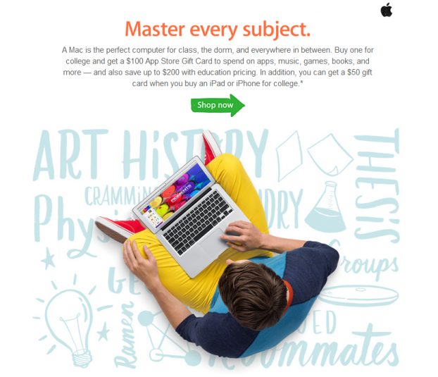
6 Tips to Design Gorgeous Emails Like Apple
According to a recent study, email marketing is far more effective than social media when it comes to selling stuff online. So if you are an eCommerce merchant, it is crucial that the emails you send to your customers are both beautiful and engaging.
Apple has shown us that design clearly matters. As Steve Jobs famously said, “Design is a Funny Word. Some people think design means how it looks. But of course, if you dig deeper, it’s really how it works.” Apple’s use of clean, intuitive, user-friendly email layouts engage readers and drive interaction with their brand. Here are a few techniques learned from Apple that will allow you to create similar experiences with your customers:
- Logical Layout – Arrange your content in a deliberate pattern of importance and make sure each section relates to the next. Start with your primary message; flow into supporting messages that present alternate viewpoints; and end with recovery messaging that gives the reader the option to further engage with your brand and/or products.
- Less is more – There is temptation to put a ton of content in emails, but the truth is a concise message with bold, clear statements and plenty of white space improves user-experience and message comprehension.
- Unambiguous call to action – Identify the single most important thing you want your recipients to do, and succinctly state it in one to three words.
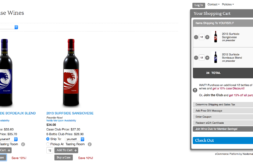
- Different perspectives – Editorial Content such as ratings and reviews, how-to guides, and usage ideas can shine a new light on your products. Cross-promoting similar items is another great tactic.
- Optimize for Mobile – Whether the recipient is on a desktop or mobile device, the email experience should be equally engaging. Here are a few tips for mobile optimization:
- Set message width to properly scale
- Increase font size to at least 13 pixels (or 10pt) to ensure readability
- Add padding to buttons and links to account for 45 pixel touch area
- Increase white space between content sections to avoid accidental clicks
- Avoid Dead Ends – Rarely, do recipients view an email in its entirety. They almost always view emails in snippets within a window, so it is important to design your messaging so that each section lays the groundwork for the next, whether it’s a scroll or a click. Using an “S” curve creates a logical layout structure and entices readers through your email. Always end your message with an action your readers can choose to take, like “learn more” or “buy now”.
Do you have any tips for creating effective email campaigns that you’d like to share? Please let us know in the comments below!
Currently an eCommerce Account Manager at Nexternal, Matthew enjoys helping businesses succeed online. Prior to joining Nexternal, Matthew spent years implementing innovative marketing campaigns for a world renowned design firm and is particularly passionate about online marketing and entrepreneurship.