Redesigning Your Store without Overhauling Your Design
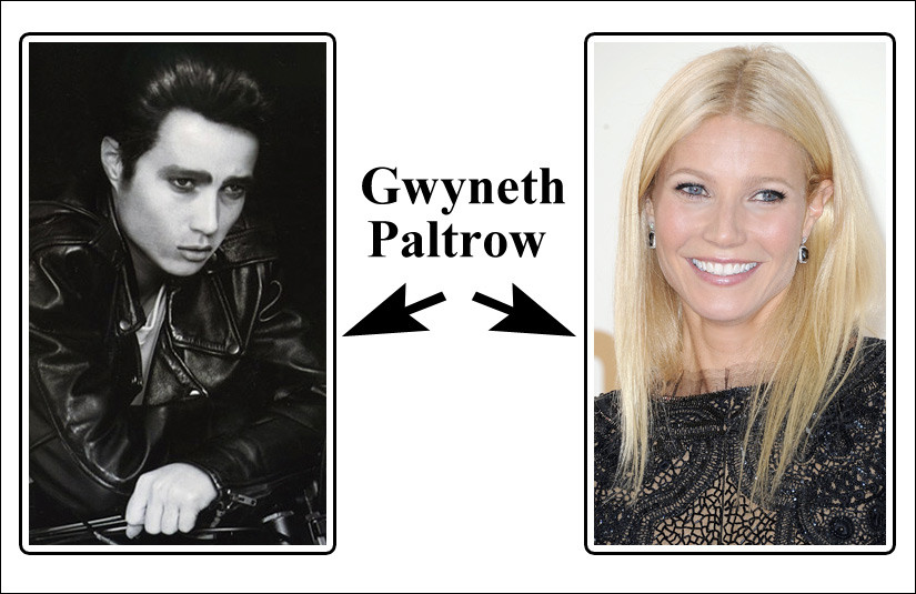
Yes, that is Gwyneth Paltrow. In the amazing photograph above, makeup artist Kevin Aucoin was able to create the illusion of a completely new facial structure. No plastic surgery or prosthetics needed. He altered the appearance of the individual component features (eyes, mouth, hair, etc.), and birthed a totally different looking overall face.
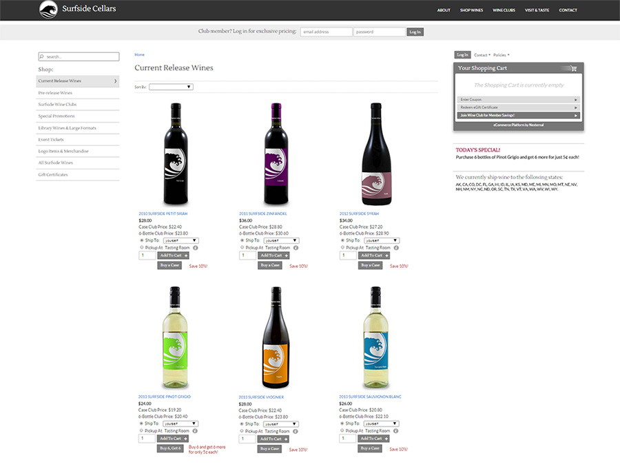
As an eCommerce merchant, you know that your site design is massively important. If you need a new design, you might be tightly gripping your wallet in anticipation of a massive hit under the misguided belief that you need to start from scratch on an expensive overhaul. But as Mr. Aucoin showed us above, and we will demonstrate below, you can simply adjust some elements of your design for a highly effective overall design transformation without touching the framework. You can save time, affect conversion, and save money in the process.
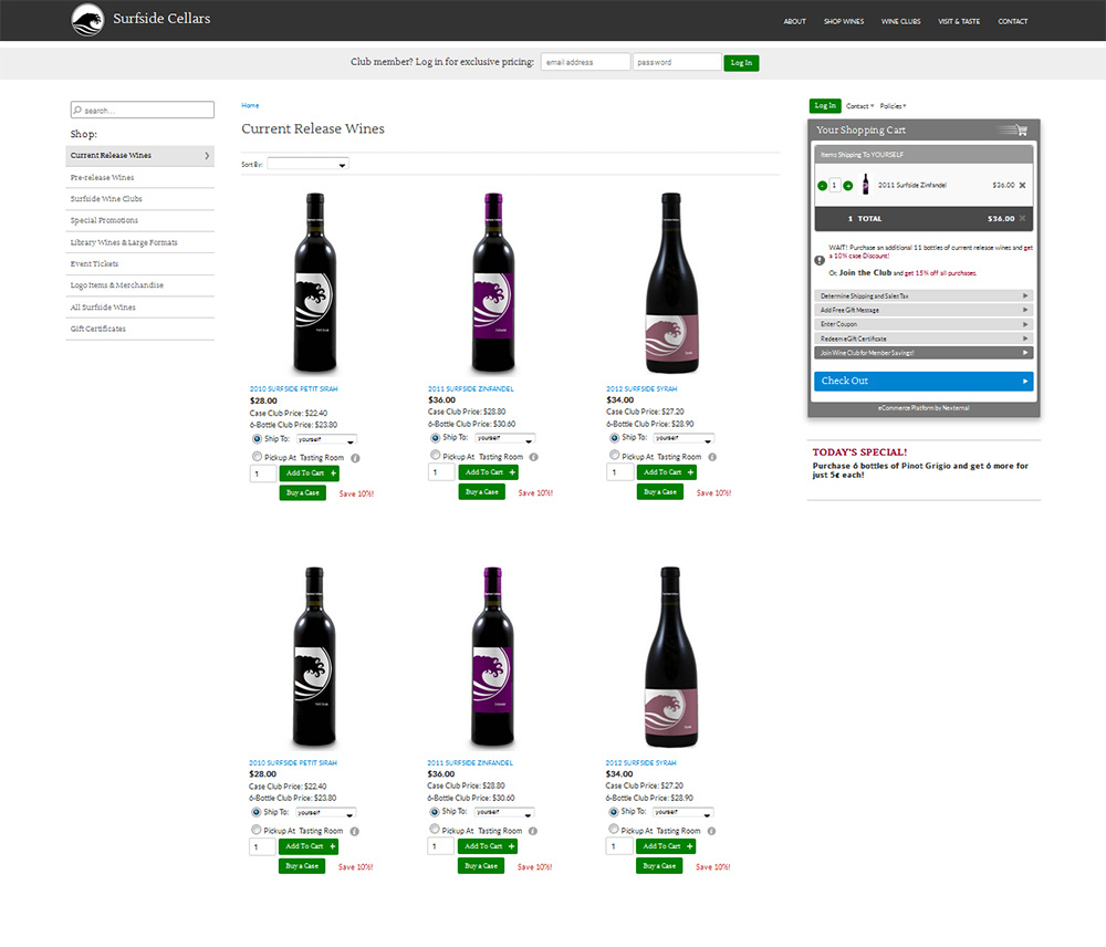
Action button styling. Numerous studies have shown instances where eCommerce companies simply changed the color of their “add to cart” or other action buttons, and their conversion rates spiked. A simple color variation can be very effective! Check out the effect in the example below.
Beyond color, there are a multitude of other modifications you can make to your action buttons, including their shape, size, spacing, and font. Play with your buttons! If you have a lot of buttons, consider removing some of them to add more open white space to a cluttered site. Alternatively, try adding a button to draw attention to something important.
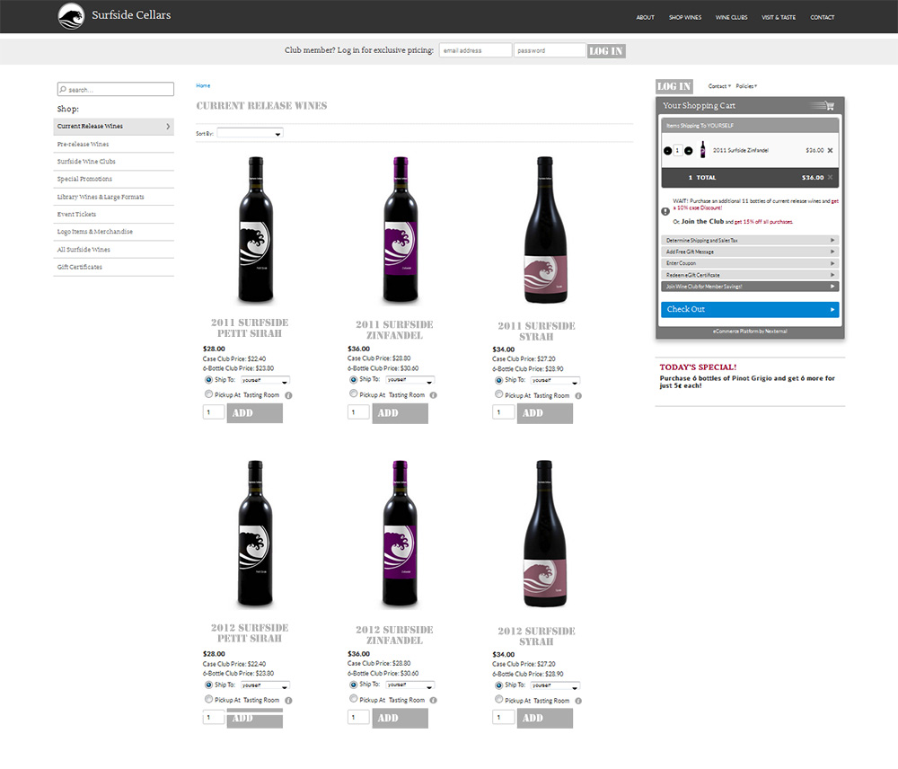
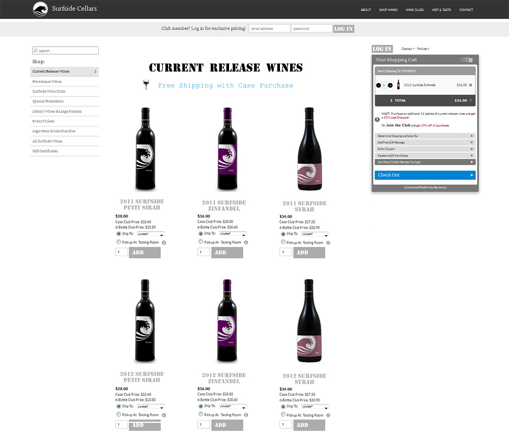
Fonts. There are a lot of wonderful typefaces out there, so beware of the temptation to go font crazy! Usability experts typically recommend sticking with an easy-to-read sans serif font for your main content. However, using some restraint, you can get a little more playful and incorporate a fun new font on your product names, buttons, or category thumbnails. Alternatively, you can stick with your existing font, but simply play with the weight or size of your text for dramatic effect. Check out how the font changes the overall effect in the examples below.
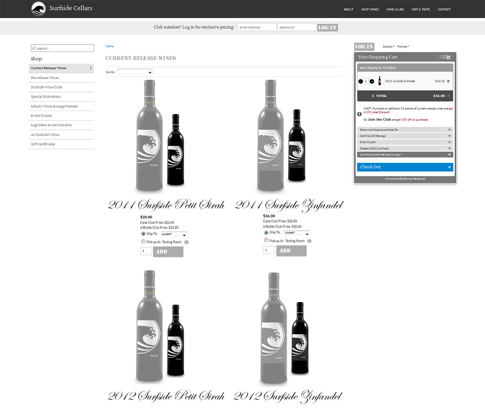
Images (including sizing, spacing, or quantity). Nothing speaks more loudly on an eCommerce site than your images. Text is often skimmed or skipped, but even a quickly moving consumer eye processes an image. If your product images are poor, you may actually need to hold a new photoshoot and invest in some quality. However, if you are working from a solid foundation of images, you can significantly transform your site design by making your images larger or smaller. Notice how the example site above changed with larger black and white product images and effects (aside from fonts). Alongside of that adjustment, if you are using a tiled layout, you might also adjust the number of thumbnail images you are displaying across on a category page.
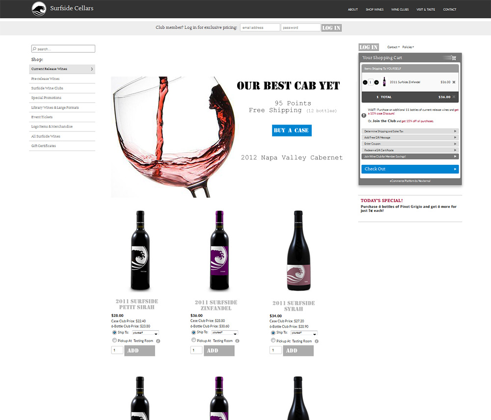
Category header image or storefront. If you are a Nexternal client, the category description field is an open HTML field where you can style text, images, links, and so on. This area is often completely overlooked as a design option, but it’s such a hidden gem! The most common two design uses for this area are promotions (allowing you to direct shoppers to a particular product) and category name styling (a great opportunity to incorporate fun fonts or images). In the example below, we added a category image to the current release category, which is also the storefront on this site. Notice how it functions as a focal point and completely transforms the page. You can do the same kind of thing to your storefront, if you are not using a category as a storefront.
Talk to your account manager about your design ideas, or for assistance in implementing your changes. Designer assistance may still be required, but an estimate can be provided.

