Little Buttons, Big Sales!
It’s always a challenge to create compelling calls to action that don’t require a lot of reading or thinking on the part of the shopper, and effectively get the shopper to make a purchase or add more to their cart before checking out.
Once you decide upon the promo you’ll run and the compelling copy you’ll craft, then you have to decide where on your website a shopper is most likely to see it – the home page, the always onscreen shopping cart, top of the category, the product page long description, the header, the left column, the right column, or some combination thereof… the list goes on and on. Your decision will of course vary depending upon the promo and your website and product catalog structure.
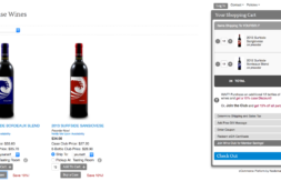
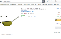
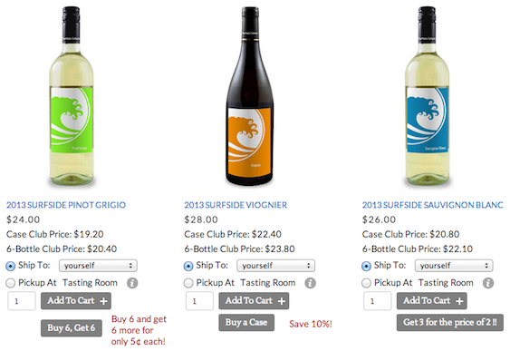
One place that’s a sure winner for an upsell message or promo call-to-action, is right by the “add to cart” button on a product detail page. Placed there, it *speaks* to shoppers at the very instant they are making a decision to buy – and just as they are about to add a product to their cart, you give them an even better idea – for example: {Buy 12 and save 10%}, or {Buy 6 and Get 6 more for 5¢ each}, or {Get 3 for the price of 2}, or {Buy one, Get one Free}.
In the image at the top of this post you can see three different examples of this strategic placement of upsell and promo buttons, some of which we showcase regularly on Nexternal’s best practices wine demo site at surfsidecellars.com. When combined with the powerful pricing and promo features built into Nexternal to effect the creative ideas promoted by these little buttons, you can produce big sales whether you’re selling wine, widgets or whatnot.
Be sure to contact your Nexternal account manager today to get started with this powerful tool to promote higher sales. We’ll help you set up the promos and the buttons to ensure the strongest results.

