7 Best Practices Learned From One Retailer’s Amazing Email Marketing
With all the hype around social media these days, it’s not uncommon for online marketers to spend far more time on social media projects than on email marketing campaigns. However, most merchants will find that effective email marketing is still the number one driver of new orders! My marketing subconscious has been analyzing marketing emails for years and I have come to notice some patterns amongst successful retailers. One retailer in particular, The Clymb, hits the nail on the head with their email marketing! In fact, I get an email from them every day and crazy as it may sound, I look forward to it! So what does The Clymb do that I like?
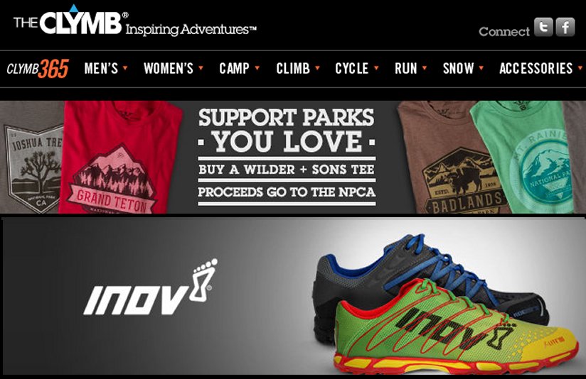
- Images – For each category or brand they are pushing that day, they have a big image that takes up the width of my email. Not only do these wide images look great on my laptop they look great on my iPhone! They typically either feature a fun action shot of someone using the product or one of the more attractive products in that line.
- Categorization Header – Similar to pages on their website, the email has a navigation template at the top of every email making it quick and easy for me to jump directly into a category.
- Descript Subject Lines – Their subject lines often tout both brands and categories. For example, the subject line in an email I recently received was, “Oakley, surf apparel, wooden sunglasses, runners’ watches, casual apparel, canine equipment, and more + Summer ski and snowboard camps!” Although it is long and reads a lot like a keyword list, it only takes one catch phrase and they have my attention!
- Timing – Almost all of the emails I receive from The Clymb hit my inbox a few minutes after 8 a.m. – when I am sitting at my laptop and most likely to order! Although the emails do look good on my iPhone, I am more likely to order when I have a full-sized keyboard in front of me.
- Call to Action – With emails from The Clymb, each big image is clickable. Additionally they have a blue circle with a black arrow in it next to every mini-description. The arrow is non-obtrusive, but it is clear to me that I can click through to order.
- Urgency – At the bottom of each email from The Clymb is a section titled, “There’s still time, don’t miss” with a list of deals that are soon to expire. There’s nothing like a looming deadline to get people to act!
- Social Media – In a non-disturbing way, at the top of each email they let me know I can connect with them on Facebook and Twitter. Although it may have looked like I was knocking social media at the beginning of this article, the truth is that I love it and think every retailer should have links in their emails asking customers to connect with them socially! It’s just creates another channel for communication.
As a consumer, you probably have some companies that you think put out great email marketing campaigns. Who are they and what are they doing? Please share by adding a comment to this blog!

