Is Your Website Seen as “Mobile-Friendly” in Google’s Eyes?
By now, every online merchant should be aware that mobile traffic to their website is on a significant rise. It should also be acknowledged that some predict that in 2014, mobile search will exceed desktop search. Google, the largest of all search engines, acknowledged this shift last week by taking a significant step towards providing a better search experience for their mobile users.
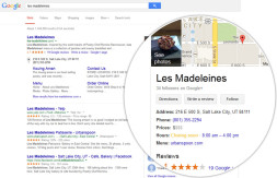
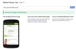
When searching from a mobile device, Google’s Search Engine Results Page (SERP) will now display “Mobile-friendly” below the page title as seen in the examples below:

While visually this change may seem subtle, to the person executing the search on their mobile phone, the term “Mobile-friendly” acts as a significant directional sign guiding them towards the path of least resistance.
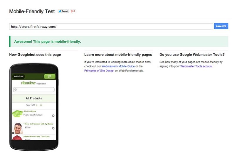
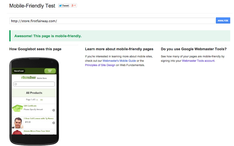
If you are unsure if your website is considered “Mobile-friendly”, or you just want to confirm your mobile site qualifies for Google’s “Mobile-friendly” designation, you can use the tool provided by Google here.
If you don’t have a mobile version of your website, this should be an enormous push for you to get one! You can hire a designer, or you can even consider a quicker and less expensive approach as mentioned in this Nexternal blog post from last year.
Having a mobile friendly version of your website has officially become a vital necessity for retailers across the board. Be sure that you’re not hindering your business’ success by neglecting to have a “Mobile-friendly” version of your website in place.
eCommerce Ninja by day and husband & father by night. Since 2003 Ty has been part of the fast growing eCommerce industry both as an Account Manager and online retailer. Ty has played a vital role in the conversion, launch and day-to-day operations of hundreds of online businesses ranging from multi-million dollar corporations to one and two person companies.


