Free Shipping: 3 Tips to Imitate and Avoid from eCommerce Stars

It’s not what you say; it’s how you say it. We sometimes forget the wisdom of that old adage, but when you’re in the business of ecommerce, where users will scan (not read) a page in fewer than four seconds and decide to stay or go, that’s a truth that can’t be denied. And how you “say” things on your site refers not just to the actual copy, but where you place your content, and how it looks.
Let’s focus on a free shipping message, for example. This is a very common promotion for many companies that sell online. It seems so simple! Yet when I visited the sites of some very successful companies to compile a best practice list, low and behold, I found less than perfect execution. Below is a list of the things they could have done a bit better (mistakes to avoid) and a few examples of companies who did it right.
Mistake #1: Not drawing attention to the message.
Offender – www.maccosmetics.com. MAC offers free shipping on US orders, but when you visit their site, don’t be surprised if you miss the message! MACs free shipping message is pretty tiny, and held in the bottom left corner of the screen. Although the text is bolded, it has a pathetic chance of being noticed in the shadow of MAC’s glorious, artistic rotating images that consume the vast majority of the page. Give your promotion some good real estate, and definitely place it above the fold. Use bold lettering, all caps, larger font, or a color variation, as long as it still fits with the look and feel of your site. Don’t drown out your brand, but make sure it’s not missed.

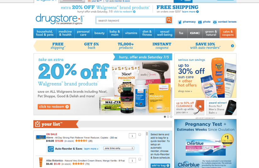
For a great example, look at how drugstore.com does it. The opening page of the site has a lot going on, yet you can still see that ever-important free shipping message at the top and center with its strong placement and font choices.
Mistake #2: Making your message too wordy, or emphasizing the wrong part of the offer.
Offender – www.champssports.com. Champs Sports did a good job with message placement, and highlighting its 20% off discount. However, the free shipping message is out of the spotlight, given no emphasis with fonts, colors or sizes, and camouflaged by other text. Instead, of drawing attention to its shipping offer, Champs bolded its coupon code. We know that shoppers scan websites, and the word “free” attracts attention. So place more attention on the attractive part of the bargain, and de-emphasize qualifiers, such as a minimum order criteria.

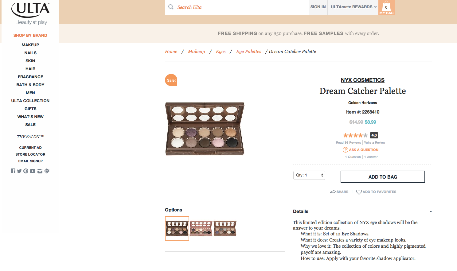
See how both drugstore.com and ulta.com are shining examples with the bolded “Free Shipping” text, and then used smaller fonts and line breaks for minimum order criteria.
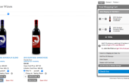
Mistake #3: Not maintaining the message throughout the store.
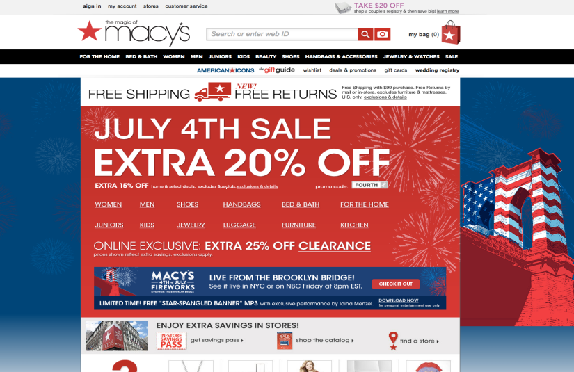
Offender – www.macys.com. Macy’s normally does a fantastic job of everything, so I was surprised by this misstep. Below is the macys.com homepage, with a fantastic free shipping message.
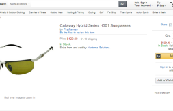
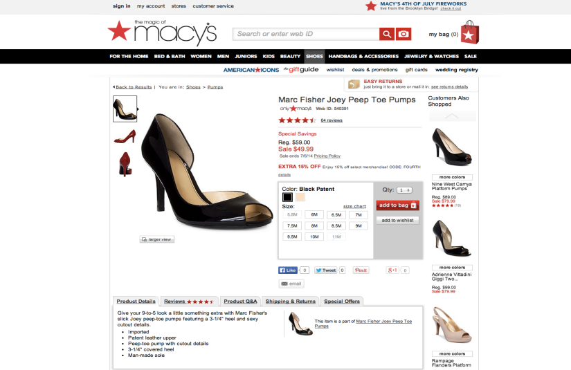
Next, you can see an example product page, where there is no mention of free shipping. Always remember that not everyone who visits your site will enter at your homepage or storefront. Many customers may link directly into a product page, so you should make sure they see the important message that might help them convert! Keep your message on every page of the site. Refer back above to see how ulta.com keeps it front and center.
Apply the wisdom above, and you should be on your way to maximizing your shipping promotion.
Lanette Willis is a Senior Account Manager at Nexternal. Before joining Nexternal she spent nearly a decade working in market research and professional services marketing, before running her own successful eCommerce apparel business. Lanette is passionate about helping people and businesses thrive.