Unify Your Brand Message on Your eCommerce Site and Packaging
A clean and unified brand message has always been important, but it’s become all the more so with the rise of brands like Apple, which made the genre what it is today. A succinct, on-point message and design that permeates every aspect of your branding will integrate seamlessly with your customers’ experiences in the world, so that your brand will pop up organically whenever it is most relevant. Just think about how powerful this is: as a customer, you know, for example, that when you visit the Apple website, you’ll encounter a design that’s as streamlined and intuitive as that of your iPhone or even the box that it came in. The same goes for Apple stores, and even Apple employees. There is brand unity across every level of the brand experience, even as the company continues to add to products and services to its diverse ecosystem. And if you buy into that messaging, it will become integral to your own “ecosystem” as well.
How does Apple do it? If you’ve ever been in charge of a business, you know that keeping this centralized core while also adding new businesses and services is a challenge, to say the least. As you diversify your product line, you may be tempted to broaden your audience as well, which can lead to brand dilution. If this sounds like you, read on: below, we’ll take a deep look at a few companies that really get it right from their eCommerce site to the product packaging and see what lessons we can glean.
1. Julep
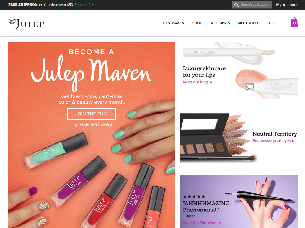
Hop on over to the Julep website, and you’ll immediately encounter a bright yet gentle color scheme — one that parallels the colors on offer in the company’s diverse makeup line. But those colors reflect even more than that: they’re right in step with the company’s super positive and friendly core mission to connect friends through beauty products. Julep believes in “collaborating with customers” and accordingly draws the bulk of its inspiration through crowdsourcing. That’s something that’s driven home not only by visual design but also by the user experience both on the site and on the company’s packaging. Customers actively help choose new lines, and the company names lines after the women who inspire them most.
Recently, the company took their interactivity up a level with this beauty quiz, which empowers customers to find their own unique style (which, of course, requires an email address to send results, thereby ushering customers deeper into the brand).

Last but not least, with their Powered by Girlfriends initiative, Julep is constantly on the lookout for female empowerment causes they can lend a hand to, whether that means giving to an anti-trafficking organization or sitting down with their suppliers to discuss programs for supporting women in the workplace.
Lessons Learned:
With every interaction the customer has with the brand, the Julep message is clear: “beauty is about connection, not competition.” Before you can get to work unifying your brand, spend a little (ermh, a lot) of time setting a core mission that’s as strong as Julep’s. Keep in mind that a mission is something that is overarching — it’s the umbrella off of which you hang every other spoke. You may, for instance, believe in keeping prices low, but unless you’re ready to integrate that into everything you do, that may be a feature to trumpet, but not the core of who you are.
Once that core is set, it should inform everything from your voicing to your design, your products and your marketing campaigns.
2. ModCloth
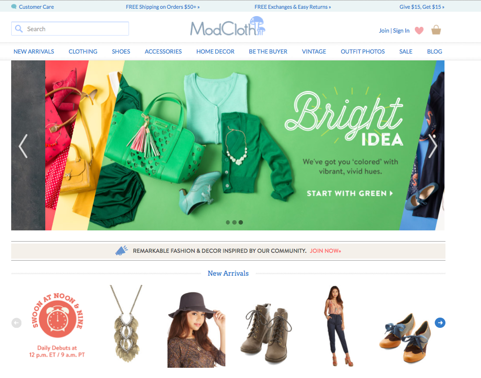
No discussion about distinctive and unified branding would be complete without ModCloth. While ModCloth certainly incorporates some of the same elements as Julep, what Julep puts at its core, ModCloth utilizes as one of those supporting spokes. In fact, the core of ModCloth’s branding clearly stems from its products: quirky, and truly one-of-a-kind vintage clothing. The brand’s cute, sometimes wacky, sometimes silly, always adorable feel is evident in the company’s product copy, which tells a creative story about the customer (soon to be) wearing the product. This copy is highly specific, but it really gets its audience, to the point where they can’t resist clicking buy.
Just take a look at the copy for the Pull Up a Cherry Dress in White:
Strutting so stylishly past the cafe, you overhear onlookers rave about that ‘rockabilly diva’s cheerful cherry dress!’ As you turn your gaze to thank these friendly strangers, you recognize the duo – what a coincidence! Your style-supporters and friends insist you take a seat and enjoy an espresso, and unable to resist, you lean your zipped and tied back against the cool chair with a charming smile. With a collared and padded bust, one-inch straps, and a swingy A-line cut, your sprightly dress steals the subject of conversation – that is, when you’re not being complimented on your woven platforms, rouge lipstick, or vintage ‘do!
Both the title and the body of the copy itself are imbued with the same approachability and degree of adorableness as the dress itself. You won’t, for example, see the worlds “rockabilly diva” in any store’s copy but ModCloth’s. That individuality continues throughout the text, while also subtly offering further descriptions of the dresses features and suggesting gently offering accessorizing options.
But promoting individual quirk and accessibility doesn’t stop there. With a stated mission of “democratizing the fashion industry,” the company created the “Be the Buyer” movement copied by so many other brands today. With a highly creative YouTube channel, an interactive blog, incredibly responsive social media feeds, and a review section for each product that encourages customers to upload photos of them proudly wearing their purchases, it’s safe to say that ModCloth has fully made quirky empowerment a reality.
Even the company’s packaging is a core part of their branding story:
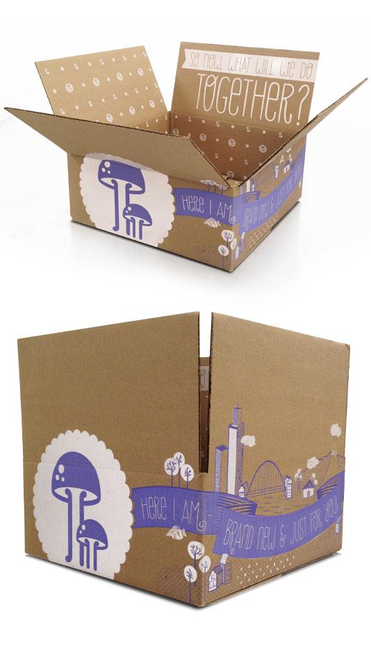
There’s just no way you can receive that process and not instantly know who it’s from — and feel entirely delighted.
Lessons Learned:
All of ModCloth’s amazing branding comes down to one thing: knowing their customers and marketing to them without divergence. While I certainly am passionate about the brand, it’s because it makes me feel listened to and known — something that another woman with a different personality and different tastes will feel entirely differently about. And that’s fine — because I, and countless women like me, are passionate enough about the brand to continue buying far more than we should.
For ModCloth, this knowledge stemmed out of the founder’s own knowledge of herself, as her collections started with pieces she felt she would wear. The same might go for you, but even if it does, it pays to do a little market research with every product. This can be done formally or on social media, the latter of which may even generate buzz you can definitely take advantage of. On that note, involve your customer in every level of your communications and design so that they feel a strong level of ownership. When you channel your customer in everything you do, from choosing products and making key business decision to creating social media campaigns, you really can’t go wrong.

If there ever were a brand with clarity of purpose, it’s Innocent Drinks out of the UK. The company was started by 3 Cambridge graduates who were really, really into fruit. This was an interest that made them extra primed to notice a gap in the market; while there were definitely smoothie companies around, none used fresh fruit. The company began when the friends set up a stand to sell their fresh smoothies along with a sign that said, “Do you think we should give up our jobs to make these smoothies?” with a box for “yes” and one for “no.” The “yes” box was filled to the brim, and so from a small but eager demand the company has seen a stratospheric rise.
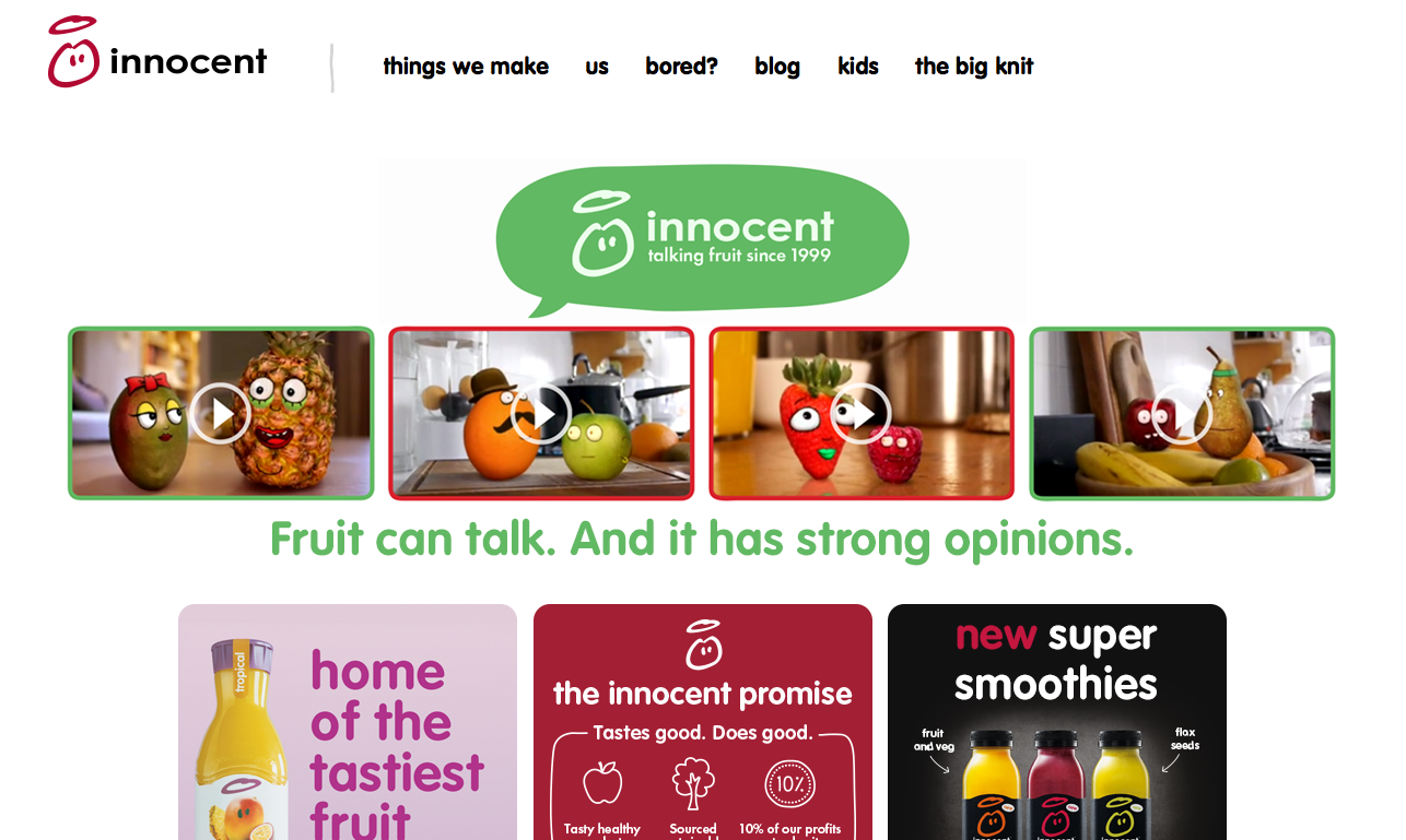
The company’s emphasis on fresh ingredients and sustainability is still evident throughout all of its branding materials. As you can see below from the featured talking fruit videos, the tone has always been down to earth and a little bit silly:
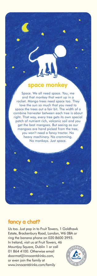
Combined, a good term for the company’s brand mission might be “approachable sustainability” — something that’s driven home right down to its packaging, which emphasizes white for purity and features its smiley face fruit nice and large in the center. The company also often tells unique stories about its ingredients on the back of the bottle, like this one here about providing enough space for mango trees to grow:
The unique and casual tone even permeates down to entirely functional phrases; on an Innocent bottle, there’s is no “Use By” date, only an “Enjoy By.”
Lessons Learned:
When I say that your brand messaging and design should be consistent across every customer interaction with your brand, I really mean every level. Innocent is a particularly excellent example of a company that does this well with packaging design, leaving no image or word un-voiced. You should do the same with yours wherever you can, and ensure that, even when your audience is more upmarket, your customers always feel like they’re in dialogue with your brand. And if you started your business for clear ethical reasons, let the world know! Customers want a brand with morals they can get behind.
The Takeaway:
From the web to product packaging, every business these days needs a clarity of purpose and a distinctive voice baked into every part of your business. Taking the time to do your branding exercises will do just that for you.
Britt Klontz is digital marketer from Distilled, a creative online marketing company. She particularly fancies online PR and spends a lot of time studying the intersection between traditional campaigns and new media marketing tactics. You can give her at shout by tweeting her @Britt_Klontz or circling her on G+.